
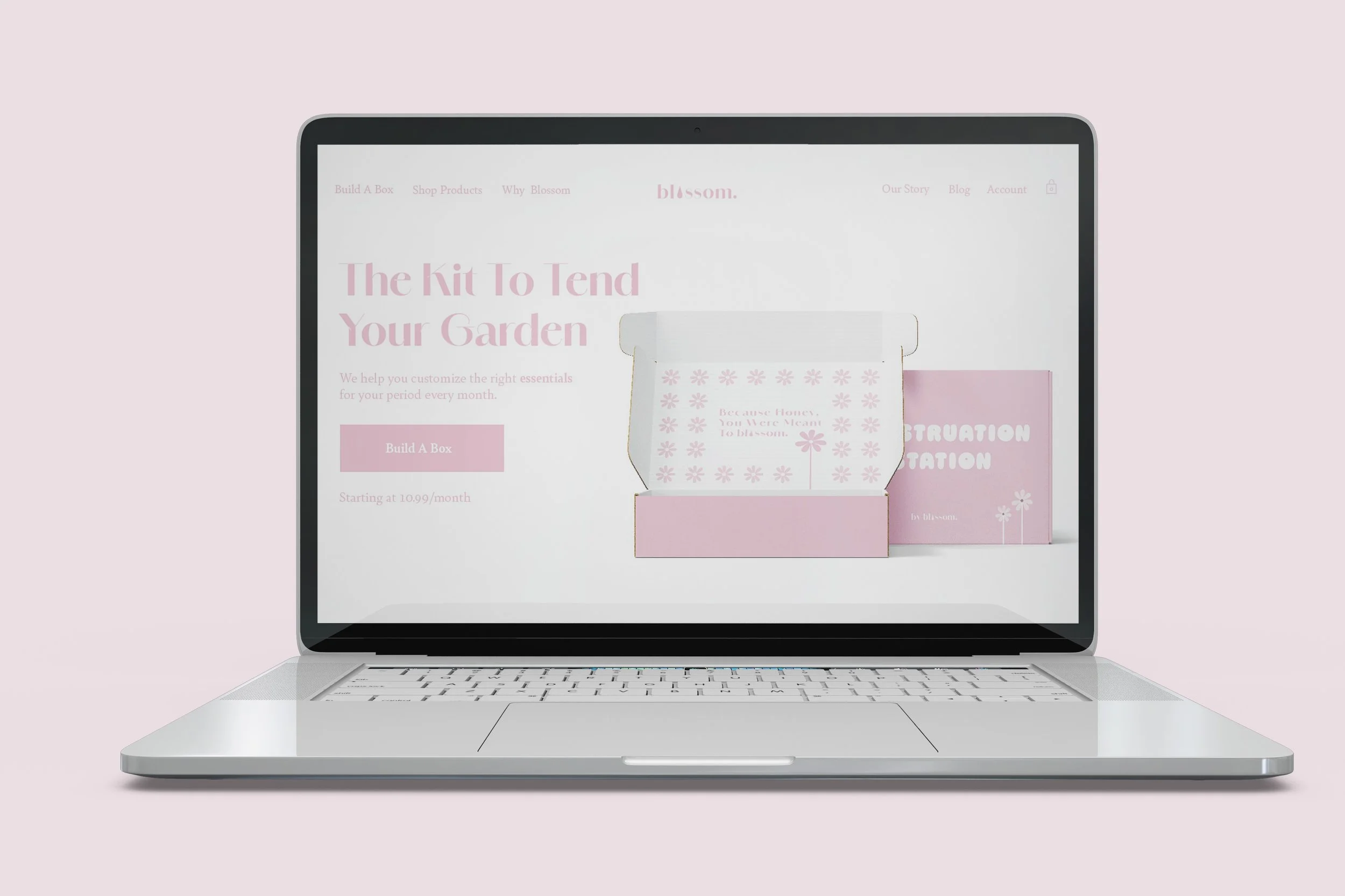
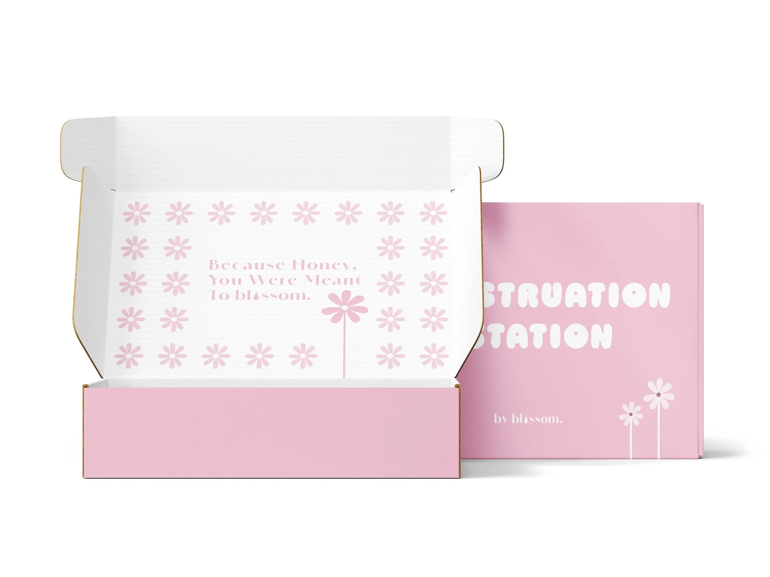
Blossom
Packaging Design / Illustration
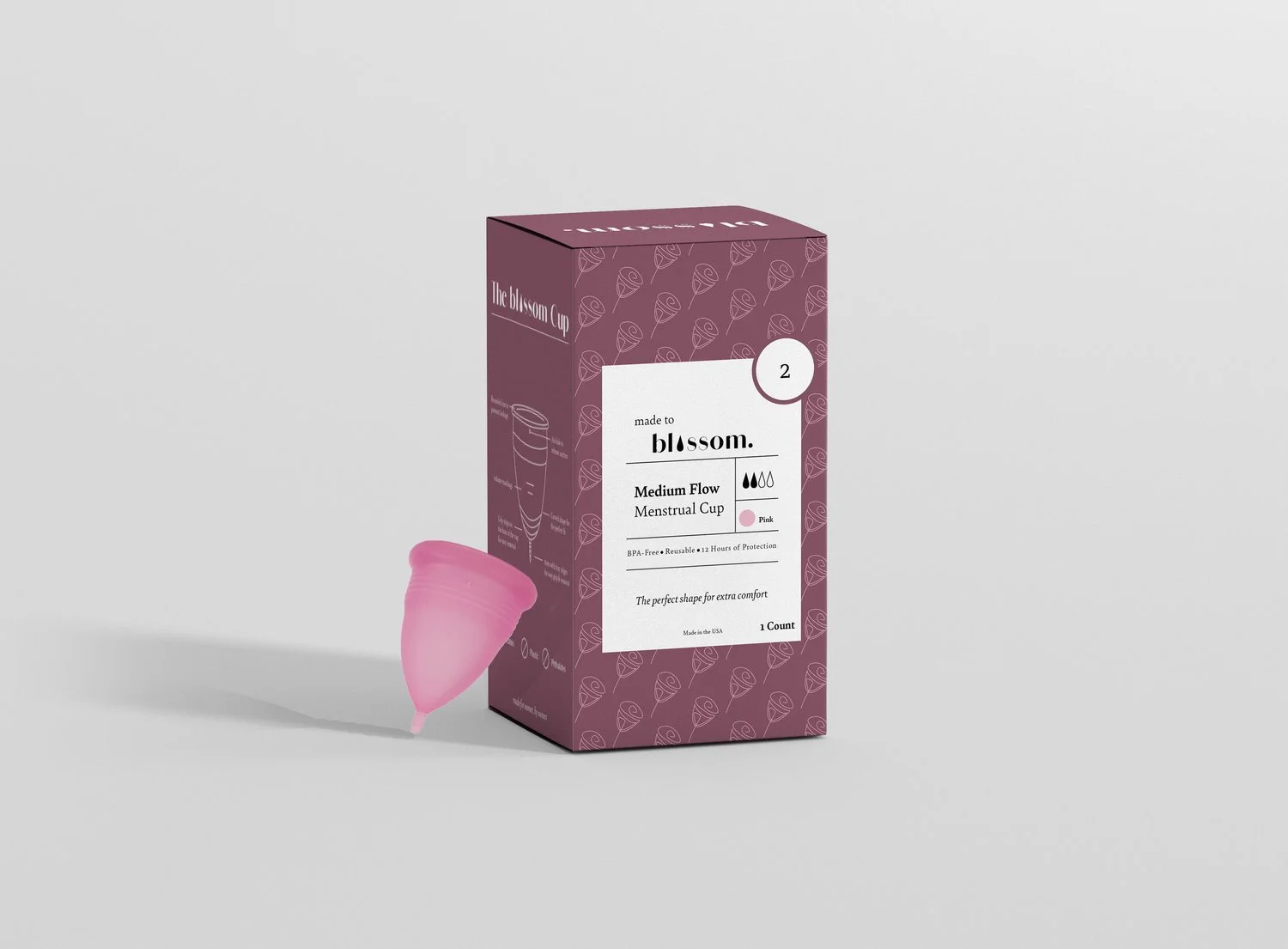
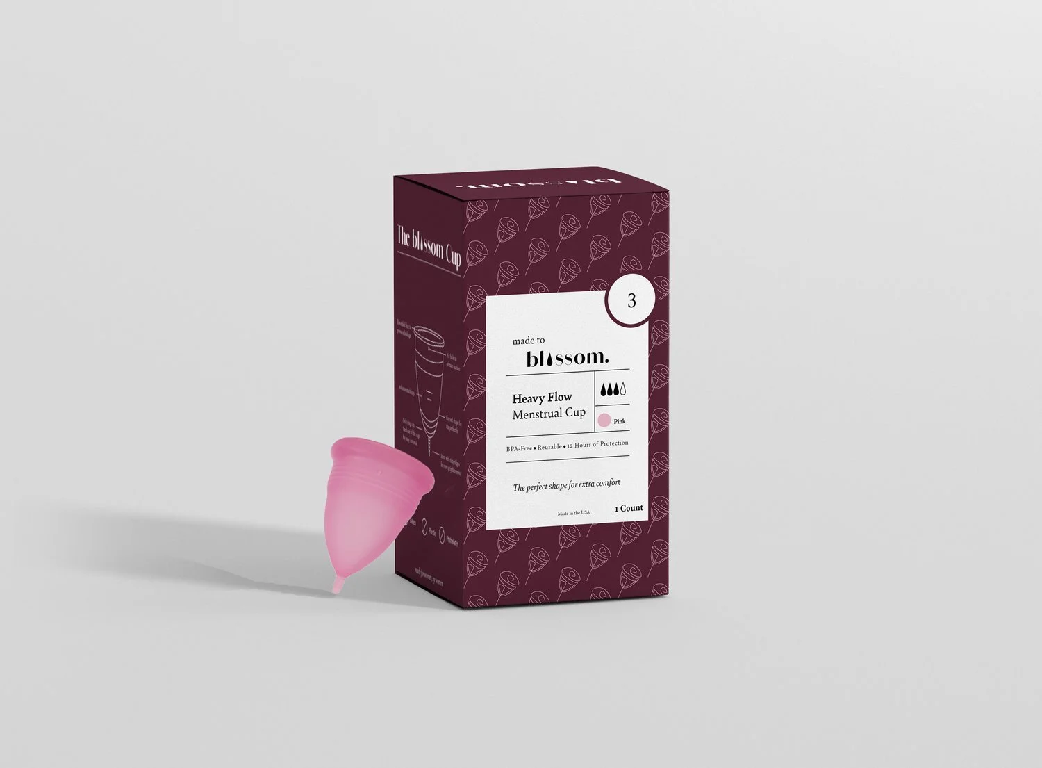
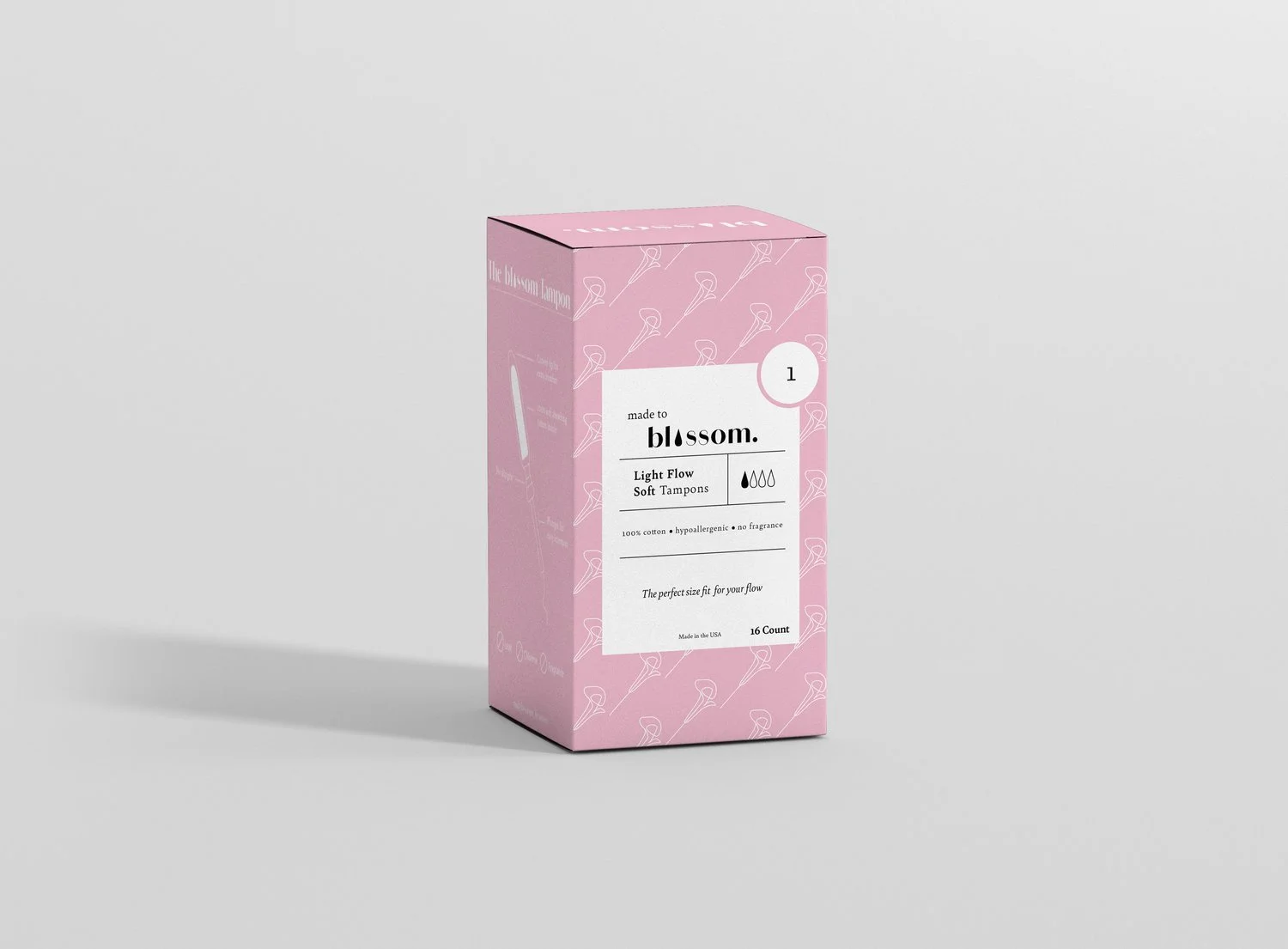
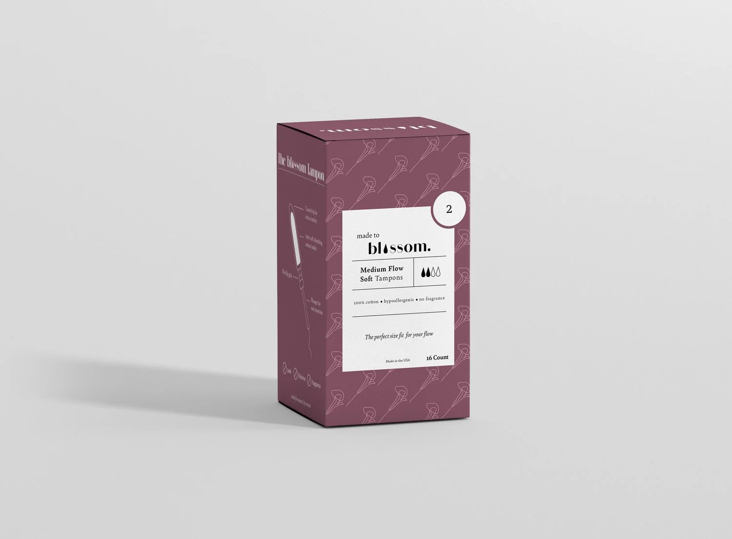
A brand named Blossom. It’s a feminine hygiene brand that helps women who don’t have access to period products. They are an all-women brand, creating products that are made by women for women. For each box bought, one is gifted to women in need.
Program Used: Illustrator, Photoshop, Procreate
Role: Packaging Designer Year: 2024
Create and conceptualize a brand, product, campaign, using only one color. I chose to create a brand called Blossom. My color was Cameo Pink. Which made me think, what does this color represent?
Challenge
Why Blossom?
This name stemmed from the color itself: Cameo Pink. It represents femininity, sexuality, warmth, and love. Most of the time we see pink being used in makeup, clothing, or accessories. Never really in period products. I want us to embrace having periods, because it’s normal!
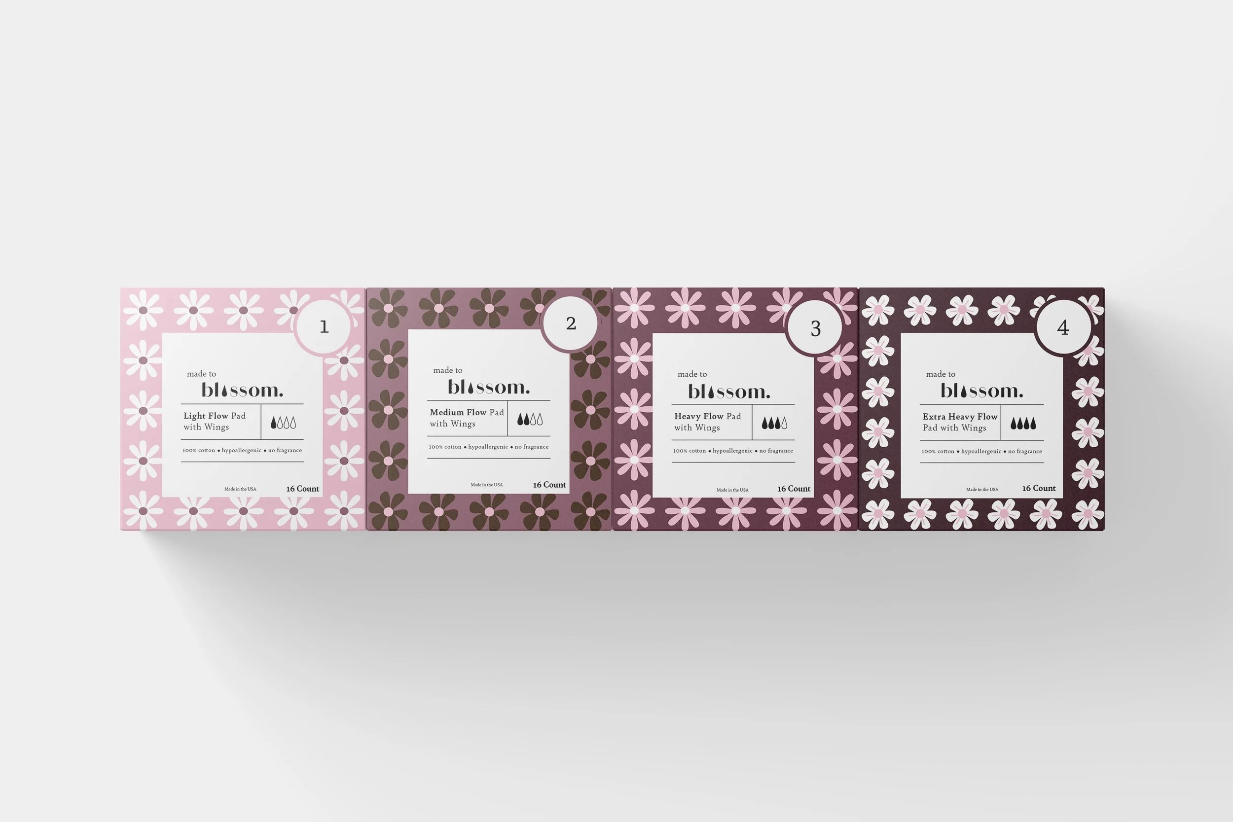
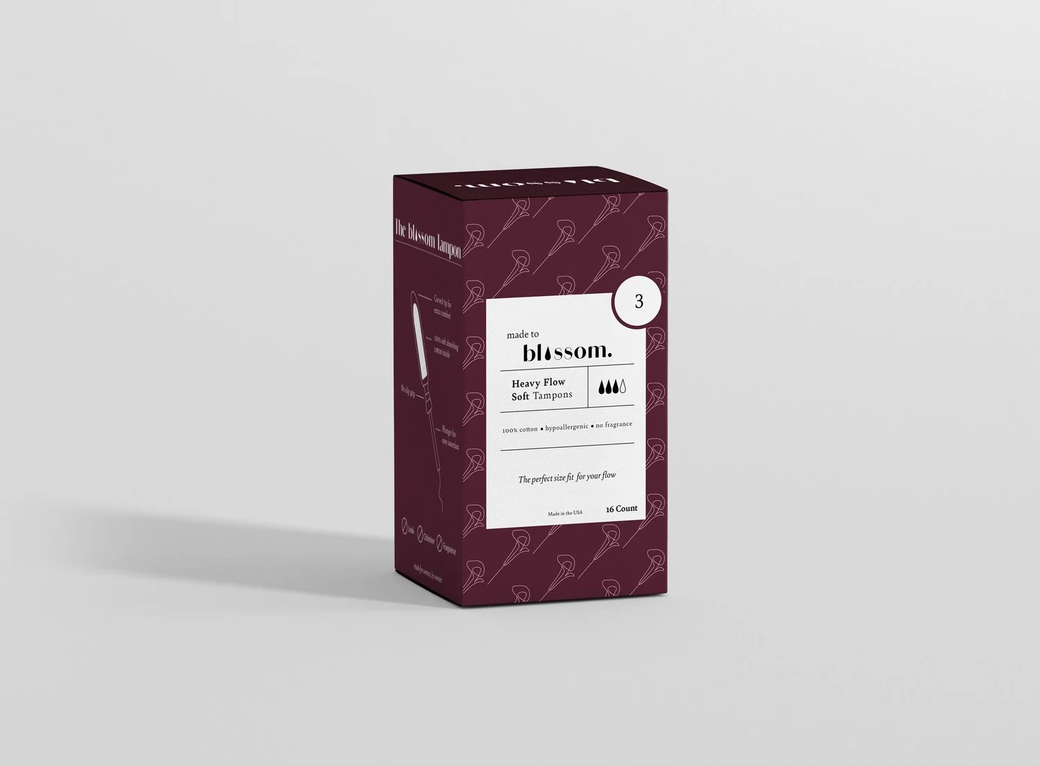
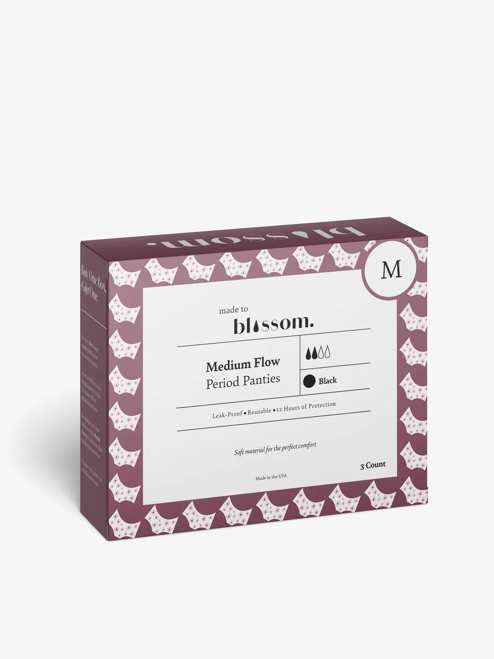
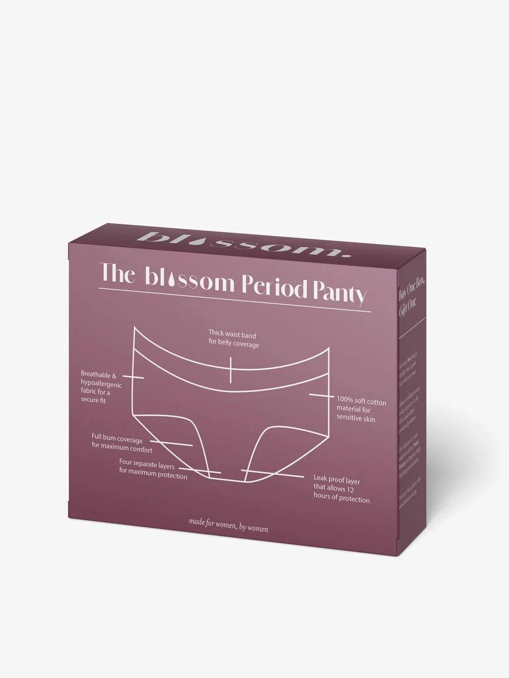
However, my main concern was making sure this product was easy to grab! I’ve seen time and time again, period products being so hard to find, wondering if it is the right pad for the right flow.
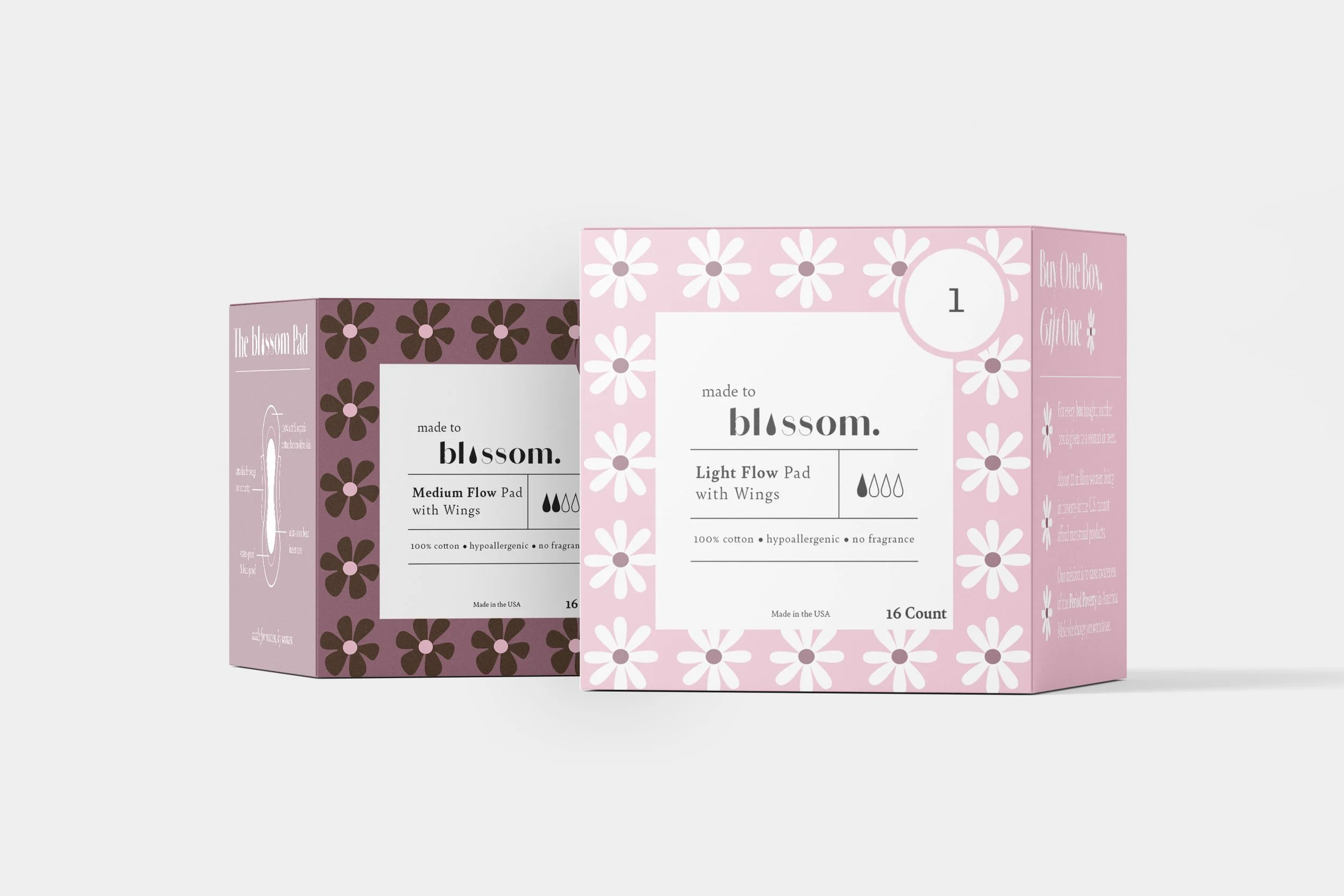
My product aims to be easy to find, numbered by the thickness and shown the flow percentage. It’s also color-coded for an extra touch of memorization!
Design Process
✿
Design Process ✿
Rough Sketches
My initial concept for this product was to create a floral pattern, simple and natural designs.
However, I wanted to keep each product alike but unique, meaning the design looks within the same family but have some uniqueness.
If you look closely to the packaging for the tampons, menstrual cup, or pads — you will notice that each flower symbolically represents the product. The menstrual cups are recognized as roses, or the tampons as tulips.


Branching OutWhile Blossom is a great product on its own, I wanted to introduce a monthly mailing subscription! It allows women to order online and get their period products monthly. And of course, some fun merch!
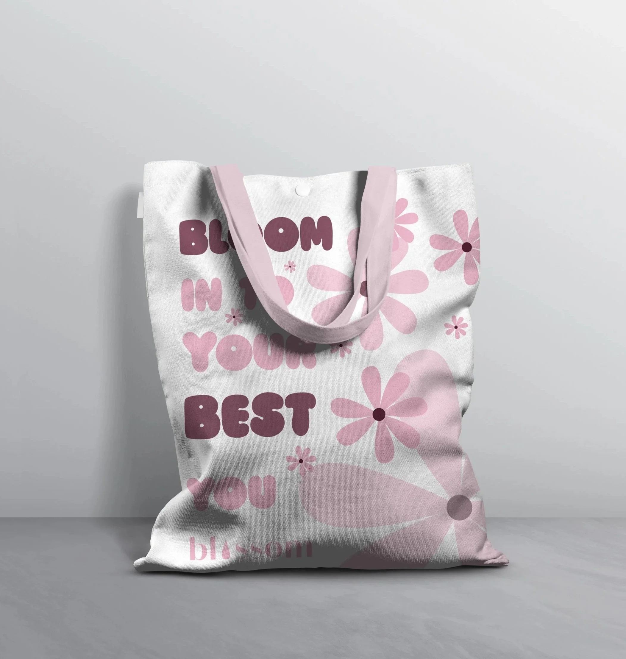

Made by Women for Women